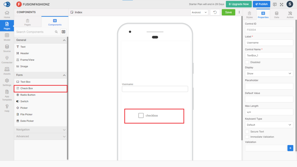
Checkbox allows an app user to select one item. This control has various properties that are explained in the below sections.
Properties
Parameter
Description
Control Name
By default, the control type is posted with a unique number e.g. Checkbox_8. Can be changed by the user using alphabets, numbers and special character (_). The maximum character limit is 100.
Disabled
Checkbox that disables the field if checked.
Display
Toggle the display of the checkbox on choosing Hide/Show.
Orientation
Choose the orientation of the checkbox from Row or Column
Max Select Check Count
Select the maximum count that is allowed from 1 to 100
Selected Item(s)
Provide values for checkbox.
Style
General
Parameter
Description
Width
Define the width from a minimum of 1 to a maximum of 310.
Height
Define the height from a minimum of 1 to a maximum of 570.
Color
Parameter
Description
Color
Choose the color for the checkbox from the color palette
Check Color
Choose the color to be used for the checkbox if checked
Uncheck Color
Choose the color to be used for the checkbox when it is unchecked
Font
Parameter
Description
Family
Choose the font for the text from System, SansPro & Google SansPro.
Size
Define the font size from a minimum of 7 to a maximum of 36
Weight
Modify the font weight between Normal & Bold.
Spacing
Parameter
Description
Margin
Define the space required between the edges of the textbox and the screen to align the text with respect to the Left, Right, Top & Bottom margins.
Padding
Define the space required between the border and the content to align the text with respect to the Left, Right, Top & Bottom margins.
Data
Direct
Parameter
Description
Order Number
Order of the menu to be displayed in the list
Icon
Icon to be displayed for each menu. Styles for icons can be applied globally.
Caption
Exact menu name should be listed on the drawer page
Navigation Page
Choose the page to which the user is to be navigated by clicking the icon in the preview.
Model
Data Binding
Parameter
Description
Data Model
Choose the data model to be used on the page
Data Field
Select the data field to be displayed on the page
Data Source
Parameter
Description
Data Model
Choose the data model to be used on the page
Name Field
Choose the name of the menu to be displayed against the icon
Icon Field
Icon to be displayed for each menu. Styles for icons can be applied globally.
Navigate Field
Choose the page to which the user is to be navigated by clicking the icon in the preview.
Auto Bind
Checkbox that binds the data automatically on selection
Events
Define the events that are to be triggered whenever there is a change.
Parameter
Description
onChange
Define an action that is to be performed when there is a change in the value