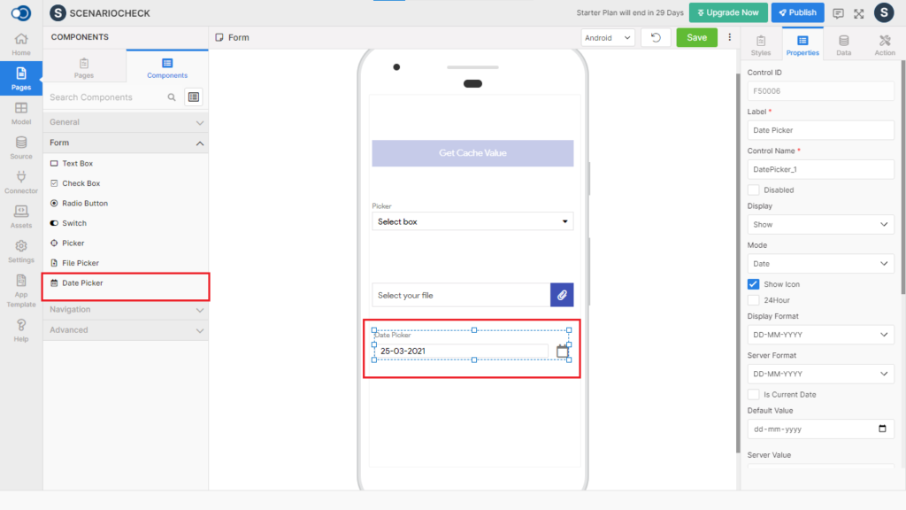
Date Picker allows an app user to select a date to be displayed on the designed page of the app. This control has various properties that are explained in the below sections.
Properties
Parameter
Description
Title
Type in the text to be displayed on the page e.g. Date
Control Name
By default, the control type is posted with a unique number e.g. Datepicker_2. Can be changed by the user using alphabets, numbers and special character (_). The maximum character limit is 100.
Disabled
Checkbox that disables the text field if checked.
Display
Toggle the display of the text on choosing Hide/Show.
Mode
Choose the mode of date from Date, Datetime and Time
Show Icon
Checkbox that displays the icon if checked.
24Hour
Checkbox that displays 24-hour time format if checked.
Display Format
Choose the display format 1. Date – DD-MM-YYYY & YYYY-MM-DD 2. Datetime – DD-MM-YYYYTLT & YYYY-MM-DDTLT 3. Time – LT and LTS
Server Format
Choose the server format 1. Date – DD-MM-YYYY & YYYY-MM-DD 2. Datetime – DD-MM-YYYYTLT & YYYY-MM-DDTLT 3. Time – LT and LTS
Is Current Date
Checkbox that indicates the date is the current date if checked.
Default Value
Displays the selected display format of the date
Server Value
Displays the selected server format of the date
Is Min Current Date
Checkbox that indicates the minimum date is the current date if checked.
Min Date
Choose the minimum date.
Is Max Current Date
Checkbox that indicates the maximum date is the current date, if checked.
Max Date
Choose the maximum date.
Allow Font Scaling
Checkbox that allows font scaling, if checked.
Android Mode
Choose the android mode from Default, Calendar & Spinner
Icon
Choose the icon to be displayed against the date picker
Immediate Validation
Checkbox that allows validation to be performed immediately, if checked.
Style
General
Parameter
Description
Icon Position
Choose the position of the icon from Right & Left
Layout
Parameter
Description
Width
Define the width from 1 to 310.
Height
Define the height from 1 to 570.
Color
Parameter
Description
Title Color
Choose the color of the title
Color
Choose the color of the date picker
Background Color
Choose the desired color for the background from the color palette
Icon Color
Choose the desired icon color
Alignment
Parameter
Description
Title Align
Choose the alignment of the title from Auto, Left, Right, Center & Justify
Font
Parameter
Description
Size
Define the size of the title & text. Choose the text size from 7, 8, 9, 10 & so on
Weight
Modify the title font-weight between Normal & Bold. By default, font-weight will be Normal.
Family
Choose the font for the text from System, Source Sans Pro & Google Sans.
Border
Parameter
Description
Width
Define the width from 1 to 310.
Bottom Width
Define the bottom width from 1 to 310.
Color
Choose the color of the border
Bottom Color
Choose the color of the border bottom
Radius
Choose the border radius from 1 to 100
Spacing
Parameter
Description
Margin
Define the space required between the edges of the textbox and the screen to align the text with respect to the Left, Right, Top & Bottom margins.
Padding
Define the space required between the border and the content to align the text with respect to the Left, Right, Top & Bottom margins.
Data
Parameter
Description
Data Model
Choose the Data Model to be mapped to datasource
Data Field
Choose the corresponding Data Field
Events
Define the events that are to be triggered whenever there is a change.
Parameter
Description
onChange
Define an action that is to be performed when there is a change in the date
onOpen
Define an action that is to be performed when the date picker dialog is opened
onClose
Define an action that is to be performed when the date picker dialog is closed