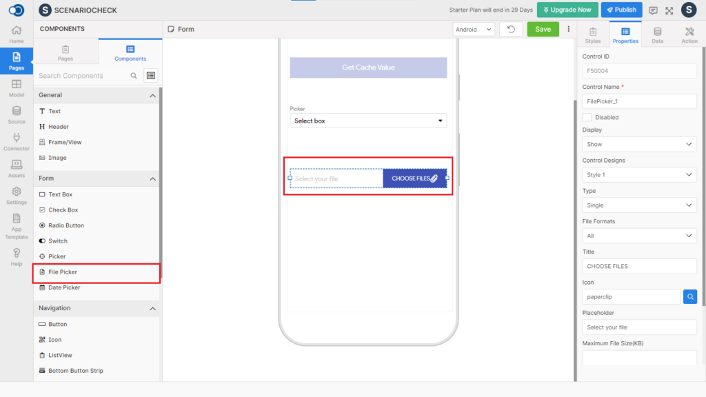
File Picker allows an app user to select and upload a file like a document, image, video, audio, and pdf. This control has various properties that are explained in the below sections.
Properties
Fields
Description
Applicable For
Control Name
By default, the control type is posted with a unique number e.g. File Picker_1. Can be changed using alphabets, numbers and special character (_). The maximum character limit is 100.
Style 1, 2, 3, 4
Disabled
Checkbox that disables the file picker if checked.
Style 1, 2, 3, 4
Display
Toggle the display of the file picker on choosing Hide/Show.
Style 1, 2, 3, 4
Control Designs
Displays the chosen style of the file picker.
Style 1, 2, 3, 4
Type
Choose the type of file picker from single or multiple
Style 1, 2, 3
File Formats
Choose the file formats that are supported in the file picker from All, Images, Text, Audio, Video & Pdf
Style 1, 2, 3
Title
Provide the title to be displayed against the file picker
Style 1
Icon
Select the icon to be displayed on the file picker
Style 1, 2, 3, 4
Placeholder
Provide a caption to be displayed against the file picker
Style 1, 2
Maximum File Size
Fill in the maximum allowable size of the file. The maximum allowable size is 5700 kb
Style 1, 2, 3, 4
Source Type
Choose the source type of the image from URL & Asset
Style 4
Source
Provide the URL from which the image is to be displayed
Style 4
Asset Link
Provide the asset link from which the image is to be displayed
Style 4
Min Select Count
Choose the minimum allowable number of files
Style 1, 3
Max Select Count
Choose the maximum allowable number of files. Max allowable count is 5.
Style 1, 3
Camera Picker Label
Provide a caption to be displayed in the camera picker label
Style 1, 2, 3, 4
Camera Picker Camera Text
Provide a caption to be displayed in the camera picker camera text
Style 1, 2, 3, 4
Camera Picker Gallery Text
Provide a caption to be displayed in the camera picker gallery text
Style 1, 2, 3, 4
Style
General
Fields
Description
Applicable For
Icon Type
Choose the type of icon from Regular, Solid and Light.
All
Icon Size
Define the size of the icon from a minimum of 7 to a maximum of 100.
All
Active Opacity
Define the Active Opacity of the icon from a minimum of 0.1 to a maximum of 1.
All
Layout
Fields
Description
Applicable For
Width
Define the width from 1 to 310.
Style 1
Height
Define the height from 1 to 570.
Style 1
Color
Fields
Description
Applicable For
Text
Choose the desired color for the text from the color palette
Style 1
Background
Choose the desired color for the background
Style 1, 2, 3
Icon
Choose the desired color for the icon
All
Icon Background
Choose the desired color for the icon background
Style 4
Border
Choose the desired color for the border
Style 1, 2
Button Border
Choose the desired color for the button border
Style 1, 2, 3
Placeholder Text
Choose the desired color for the placeholder text
Style 1, 2
Border
Fields
Description
Applicable For
Width
Choose the width of the border from 1 to 5
Style 1, 2
Bottom Width
Choose the bottom width from 1 to 3
Style 1, 2
Radius
Define the radius of the picker from 1 to 100
Style 1, 2, 3
Button Width
Choose the width of the border from 1 to 5
Style 1, 2, 3
Button Radius
Define the radius from 1 to 100
Style 1, 2, 3
Image Placeholder Border Radius
Displays the radius of the image placeholder border
Style 4
Font
Fields
Description
Applicable For
Family
Choose the font family for the text from System, Source Sans Pro & Google Sans.
Style 1
Size
Choose the font size of the text from 7 to 36
Style 1
Weight
Choose the font-weight for the text between Bold & Normal
Style 1
Data
Parameter
Description
Data Model
Choose the data model to be used on the page
Data Field
Select the data field to be displayed on the page
Events
Define the events that are to be triggered whenever there is a change.
Fields
Description
Applicable For
onChange
Define an action that is to be performed when there is a change in the text.
All
onCancel
Define an event that should happen when the file upload has been cancelled