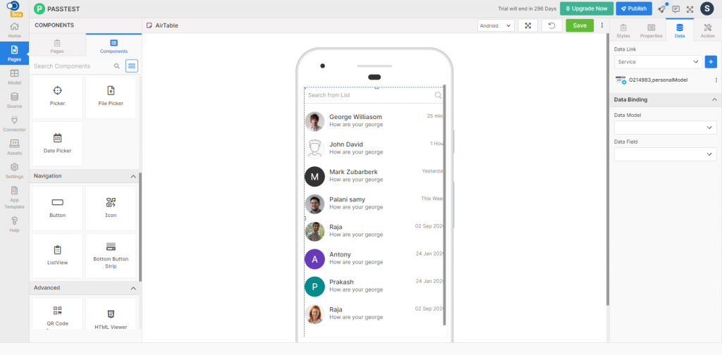
List view allows an app user to display multiple items one by one in a list. This control has various properties that are explained in the below sections.
Properties
Fields
Description
Control Name
By default, the control type is posted with a unique number e.g. listview_1. Can be changed by the user using alphabets, numbers and special character (_). The maximum character limit is 100.
Disabled
Checkbox that disables the list view if checked.
Is Search
Checkbox that displays the search if checked.
Placeholder
Provide a text to be displayed in the placeholder.
Is Add Cart
Checkbox that displays the add cart if checked.
Cart Name
Indicates the name of the cart.
Currency Type
Choose the type of currency
Color
Fields
Description
Heading Color
Choose the heading color
Content Color
Choose the content color
Right Heading Color
Choose the right heading color
Price Color
Choose the price color
Offer Color
Choose the offer color
Search Icon Color
Choose the search icon color
Text Color
Choose the text color
Placeholder Text
Choose the placeholder text color
Background Color
Choose the background color
Cart Name Color
Choose the cart name color
Cart Background Color
Choose the cart background color
Plus Icon Color
Choose the plus icon color
Minus Icon Color
Choose the minus icon color
Number Color
Choose the number color
List Background Color
Choose the list background color
Content Background Color
Choose the content background color
Font
Search Text
Fields
Description
Family
Choose the font of the search text from System, SansPro & Google SansPro.
Size
Increase or Decrease the font size from 1 to 36.
Weight
Modify the font weight from Normal to Bold.
Heading
Fields
Description
Family
Choose the font of the heading from System, SansPro & Google SansPro.
Size
Increase or Decrease the font size from 1 to 36.
Weight
Modify the font-weight from Normal to Bold.
Content
Fields
Description
Family
Choose the font of the content from System, SansPro & Google SansPro.
Size
Increase or Decrease the font size from 1 to 36.
Weight
Modify the font-weight from Normal to Bold.
Right Heading
Fields
Description
Family
Choose the font of the right heading from System, SansPro & Google SansPro.
Size
Increase or Decrease the font size from 1 to 36.
Weight
Modify the font-weight from Normal to Bold.
Text Transform
Fields
Description
Heading
Toggle the text case of the heading using Lowercase, Uppercase & Capitalize options
Content
Toggle the text case of the content using Lowercase, Uppercase & Capitalize options
Right Heading
Toggle the text case of the right heading using Lowercase, Uppercase & Capitalize options
Border – Search
Fields
Description
Bottom Width
Define the bottom width of the border from a range of 1 to 5.
Color
Choose the border color
Style
Choose the border style from Solid, Dotted, and Dashed
Radius
Choose the border-radius from 1 to 100
List Bottom Width
Define the bottom width of the list from a range of 1 to 5.
List Bottom Color
Choose the list bottom color
Border – Content
Border – List & Cart
Spacing
Fields
Description
Margin
Define the space required between the edges of the textbox and the screen to align the text with respect to the Left, Right, Top & Bottom margins.
Padding
Define the space required between the border and the content to align the text with respect to the Left, Right, Top & Bottom margins.
Data
Direct
Parameter
Description
Order Number
Order of the menu to be displayed in the list
Icon
Icon to be displayed for each menu. Styles for icons can be applied globally.
Caption
Exact menu name to be listed on the drawer page
Navigation Page
Choose the page to which the user is to be navigated by clicking the icon in the preview.
Model
Data Binding
Parameter
Description
Data Model
Choose the data model to be used on the page
Data Field
Select the data field to be displayed on the page
Data Source
Parameter
Description
Data Model
Choose the data model to be used on the page
Name Field
Choose the name of the menu to be displayed against the icon
Icon Field
Icon to be displayed for each menu. Styles for icons can be applied globally.
Navigate Field
Choose the page to which the user is to be navigated by clicking the icon in the preview.
Auto Bind
Checkbox that binds the data automatically on selection
Events
Define the events that are to be triggered whenever there is a change.
Fields
Description
Applicable For
onPress
Define an action that is to be performed when there is a press on the list
Style 1, 2, 3
onLongPress
Define an action that is to be performed when there is a long press on the list
Style 1, 2, 3
onAdd
Define an action that is to be performed when an ADD button is clicked
Style 2, 3
onPlus
Define an action that is to be performed when a plus icon is clicked
Style 2, 3
onMinus
Define an action that is to be performed when a minus icon is clicked
Style 2, 3
Actions
Define actions to be performed on the occurrence of the events.
Fields
Description
Applicable For
Navigate To
Select the page to which the app user is to be navigated when the list is clicked.