
Bottom Tab Navigator page defines a footer tab with icons that switches between pages when the end-user of the app swipes the screen. Two styles of bottom tab navigator pages are available namely Footer with Text & Footer without Text.
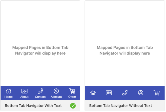
By default, the Footer With Text style is selected. You can choose any one of the styles while creating an app, and modify the styles, properties, logo, and description according to the app design.
Properties
Modify the properties by opening the page and clicking on the Edit button on the right side of the page.
| Parameter | Description |
|---|---|
| Control Name | Displays the name of the page |
| Style | Displays the selected style of the page |
| Tab1 Background Animation | Choose the background animation for the tab1 |
| Tab2 Background Animation | Choose the background animation for the tab2 |
| Tab3 Background Animation | Choose the background animation for the tab3 |
| Tab4 Background Animation | Choose the background animation for the tab4 |
| Tab5 Background Animation | Choose the background animation for the tab5 |
| Initial Selection | Choose the tab to be displayed in the initial selection |
Style
Choose your favorite styles for the pages with the following options.
General
| Parameter | Description |
|---|---|
| Animation | Checkbox that allows modification of the animation used on the page |
| Icon Type | Choose the type of the icon to be used on the page from Regular, Solid & Light |
| Icon Size | Choose the size of the icon to be used on the page from Small, Medium, Large & Extra Large |
Color
| Parameter | Description |
|---|---|
| Active Color | Choose the color for the icons when the page is active |
| Inactive Color | Choose the color for the icons when the page is inactive |
| Border Top Color | Choose the color for the top border |
| Background Color | Choose the color for the background |
Font
| Parameter | Description |
|---|---|
| Font Size | Increase or Decrease the font size of the font from 1 to 20. |
| Font Family | Choose the font for the title from System, SansPro & Google SansPro |
Border
| Parameter | Description |
|---|---|
| Top Width | Choose the width of the top border of the page |
Data Mapping
Bottom Tab Navigator page allows you to configure the datasource to be mapped to each element of the components selected on the page. You can perform direct data mapping only.
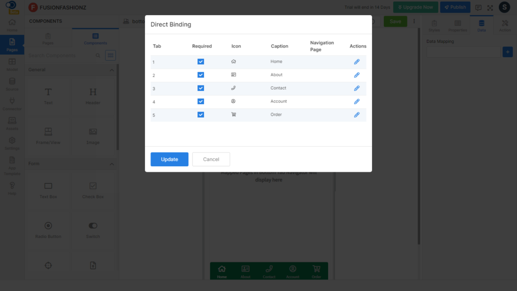
On clicking the icon against Data Mapping, the fields to be bound are displayed as shown below:
| Parameter | Description |
|---|---|
| Tab | Number of the tab to be displayed on the page |
| Required | Checkbox that allows you to select whether the menu is required on the page or not |
| Icon | Icon to be displayed against the menus of the page |
| Caption | Name of the menu to be listed on the page |
| Navigation Page | Choose the page to which the user is to be navigated by clicking the icon in the preview. |
Events
Define events to be performed whenever an action happens in the app.
| Parameter | Description |
|---|---|
| onPress | OnTabClick is fired when the user clicks on Tab |