
A drawer page is a page designed with a drawer icon allowing an app user to select a page by selecting the drawer icon or by swiping on the left side of the page.
Four styles are available on a drawer page namely
- Drawer With Icon – Center-Aligned
- Drawer Without Icon – Center-Aligned
- Drawer With Icon – Left-Aligned
- Drawer Without Icon – Left-Aligned
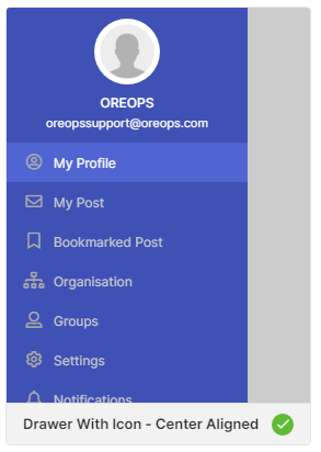
Drawer With Icon – Center-Aligned
This page has a center-aligned logo and the pre-defined menus displayed with the corresponding icons. By default, this style is selected while creating a drawer page. You can also choose the other styles while creating the page.
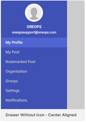
Drawer Without Icon – Center-Aligned
This page has a center-aligned logo and the pre-defined menus displayed without icons.
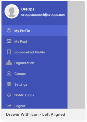
Drawer With Icon – Left-Aligned
This page has a left-aligned logo and the pre-defined menus displayed with the corresponding icons.
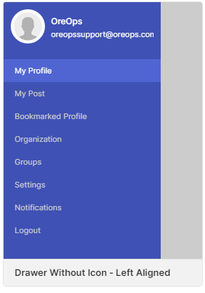
Drawer Without Icon – Left-Aligned
This page has a left-aligned logo and the pre-defined menus displayed without icons.
You can choose any one of the pre-defined styles, modify the logo name, email ID displayed and the display properties according to the app design.
Properties
| Parameter | Description |
|---|---|
| Control Name | Displays the name of the page |
| Style | Displays the selected style of the page |
| Is Header | Checkbox that displays or hides the Header of the page. By default, it is checked |
| Profile Image Type | Choose the profile image type from URL or Asset URL – Provide the URL from which the image has to be used in Profile Image Source Asset – Choose the Image from the Assets available in the application |
| Image Size | Choose the size of an image between 50 kb and 70 kb; By default, the size of the image will be 60 kb |
| Header Background Image Type | Choose the header background image type as URL or Asset URL – Provide the URL from which the image has to be used in Header Background Image Source Asset – Choose the Image from the Assets available in the application |
| List Image Type | Choose the List image type as URL or Asset URL – Provide the URL from which the image has to be used in List Image Source Asset – Choose the Image from the Assets available in the application |
| Header Heading | Provide the Heading for Header |
| Header Content | Provide the Header content |
Style
Choose your favorite styles for the pages with the following options.
General
| Parameter | Description |
|---|---|
| Icon Type | Choose the type of icons to be displayed against the list from Regular, Solid & Light |
Color
| Parameter | Description |
|---|---|
| Header Background Color | Choose the background color for the header background |
| List View Background Color | Choose the background color for the list view |
| Heading Color | Choose the color for the heading |
| Content Color | Choose the color for the content |
| List Text Color | Choose the color for the list text |
| List Active Color | Choose the color to be used when the list is active |
| List Active Background Color | Choose the background color to be used when the list is active |
| Icon Color | Choose the color to be used for the icons |
Border
| Parameter | Description |
|---|---|
| Header Background Bottom Width | Define the width of the border for the header background from the range of 1 to 5. |
| Header Border Bottom Color | Choose the color for the header border bottom region. |
Text Transform
| Parameter | Description |
|---|---|
| Heading Transform | Toggle the text case of the heading using Lowercase, Uppercase & Capitalize options or remove the style with None |
| Content Transform | Toggle the text case of the heading using Lowercase, Uppercase & Capitalize options or remove the style with None |
| List Transform | Toggle the text case of the heading using Lowercase, Uppercase & Capitalize options or remove the style with None |
Font
| Parameter | Description |
|---|---|
| Font Family | Choose the font for the text from System, SansPro & Google SansPro |
| Font Size | Increase or Decrease the font size from 7 upto 20. By default, the font size will be 12 for Heading & Content and 11 for List. |
| Font-Weight | Modify the font-weight from Normal to Bold. By default, the font-weight will be Normal. |
Data
Datasource
Data sources available on the page are of two types namely Direct and Model.
Direct
Configure the datasource as direct hardcode and add the number of menus to be listed in the drawer. On choosing the data source as direct, data binding and datasource of the model are disabled.
Data Mapping – Configure the data source to be mapped to each element of the components selected on the page. You can add the number of menus that are to be listed in the drawer.
On clicking the icon against the Data Mapping, the fields to be bound are displayed as shown below:
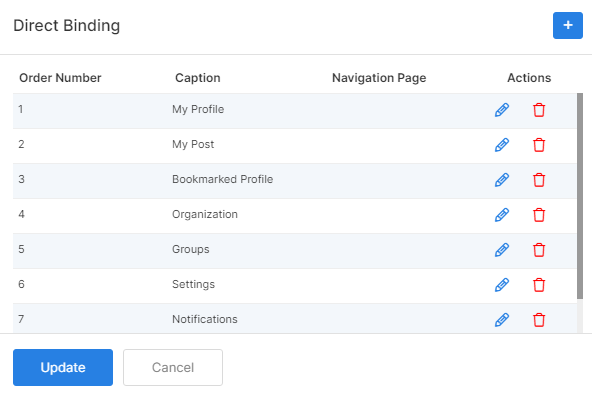
| Parameter | Description |
|---|---|
| Order Number | Order of the menu to be displayed in the list |
| Icon | Icon to be displayed for each menu. Styles for icons can be applied globally. |
| Caption | The exact menu name to be listed on the drawer page |
| Navigation Page | Choose the page to which the user is to be navigated by clicking the icon in the preview. |
Model
Configure the datasource as a Model to access the data from the model configuration. In this case, the Direct data mapping configuration is disabled.
Data Binding
| Parameter | Description |
|---|---|
| Data Model | Choose the data model to be used on the page |
| Data Field | Select the data field to be displayed on the page |
Data Source
Select the data source for this type and provide the details accordingly.
| Parameter | Description |
|---|---|
| Data Source | Choose the data source to be used |
| Data Model | Choose the name of the menu to be displayed against the icon |
| Icon Field | Icon to be displayed for each menu. Styles for icons can be applied globally. |
| Navigate Field | Choose the page to which the user is to be navigated by clicking the icon in the preview. |
| Auto Bind | Checkbox that binds the data automatically on selection |
Events
Define events to be performed whenever an action happens in the app.
| Parameter | Description |
|---|---|
| onLoad | Define an event that is to be performed when the page loads |
| onPress | Define an event that is to be performed when the user presses the drawer icon |