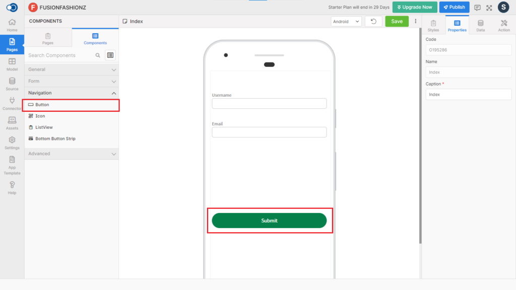
Button allows an app user to click on to perform an action on the designed page. This control has various properties that are explained in the below sections.
Properties
Parameter
Description
Text
Type in the text to be displayed on the button e.g. Submit
Control Name
By default, the control type is posted with a unique number e.g. Button_1. Can be changed by the user using alphabets, numbers, and special character (_). The maximum character limit is 100.
Disabled
Checkbox that disables the button if checked.
Display
Toggle the display of the button on choosing Hide/Show.
Form Validation
Checkbox that performs the form validation if checked.
Style
General
Parameter
Description
Button Size
Choose the button size from Default, Small, Medium, Large, Custom
Active Opacity
Define the active opacity of the button here from a minimum of 0.1 to a maximum of 1.
Layout
Parameter
Description
Width
Define the width of the text from a minimum of 1 to a maximum of 310.
Height
Define the height of the text from a minimum of 1 to a maximum of 570.
Color
Parameter
Description
Color
Pick a color for the button
Background Color
Choose the background color
Font
Parameter
Description
Family
Choose the font of the text from System, SansPro & Google SansPro.
Size
Increase or Decrease the font size from 1 to 36.
Weight
Modify the font-weight between Normal & Bold.
Border
Parameter
Description
Width
Define the width of the border for the textbox from the range of 1 to 5.
Color
Choose the desired color for the border from the color palette.
Style
Choose the border style from among Solid, Dotted & Dashed styles.
Radius
Choose the border radius from a minimum of 1 to a maximum of 100.
Spacing
Parameter
Description
Margin
Define the space required between the edges of the textbox and the screen to align the text with respect to the Left, Right, Top & Bottom margins.
Padding
Define the space required between the border and the content to align the text with respect to the Left, Right, Top & Bottom margins.
Events
Define the events that are to be triggered whenever there is a change.
Parameter
Description
onPress
OnPress event is fired when a user clicks on the button
onLongPress
OnLongPress event is fired when a user presses the button or taps a button and holds it down for one or two seconds.
Actions
Define actions to be performed on the occurrence of the events.
Parameter
Description
Navigate To
Select the page to which the app user is to be navigated when the icon is clicked.