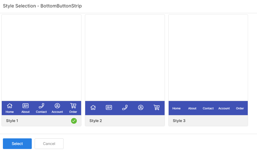
Bottom button strip also referred to as a footer allows an app user to display a set of menus at the bottom of the designed page. There are 3 different styles in headers, you can choose anyone among them.
Properties
Parameter
Description
Control Name
By default, the control type is posted with a unique number. Can be changed by the user using alphabets, numbers, and special character (_). The maximum character limit is 100.
Disabled
Checkbox that disables the footer if checked.
Display
Toggle the display of the footer by choosing Hide/Show.
Style
Indicates the selected style of the footer
Data Mapping
Configure the data source to be mapped to each element of the components selected on the page. You can map a maximum of 5 menus only.
Parameter
Description
Tab
Number of the tab to be displayed in the page
Required
Checkbox that allows you to select whether the menu is required on the page or not
Caption
Name of the menu to be listed on the page
Icon
Icon to be displayed against the menus of the page
Navigation Page
Choose the page to which the user is to be navigated on clicking the icon in the preview
Icon Color
Choose the icon color
Label Color
Choose the label color
Background Color
Choose the background color
Style
Choose the styles, layout design, font types, etc., for the bottom button strip/footer.
General
Parameter
Description
Icon Type
Indicates the type of icon displayed in the header that is selected from Regular, Solid, and Light patterns.
Color
Parameter
Description
Background Color
Choose the background color
Foreground Color
Choose the foreground color
Divider
Choose the divider color
Border Top
Choose the border top color
Font
Parameter
Description
Icon Size
Increase or Decrease the icon size from Small, Medium, Large & Extra Large.
Label Size
Increase or Decrease the font size from 1 to 20.
Family
Choose the font of the text from System, SansPro & Google SansPro.
Border
Parameter
Description
Top Width
Define the top width from 1 to 5
Divider Width
Define the divider width from 1 to 5
Events
Map the icons available in the Footer and the events that should happen.
Parameter
Description
OnItemClick
OnItemClick event is fired when the app user clicks on the item of the bottom button strip control
Actions
Define actions to be performed on the occurrence of the events.
Parameter
Description
Navigate To
Select the page to which the app user is to be navigated when the menu icon is clicked.