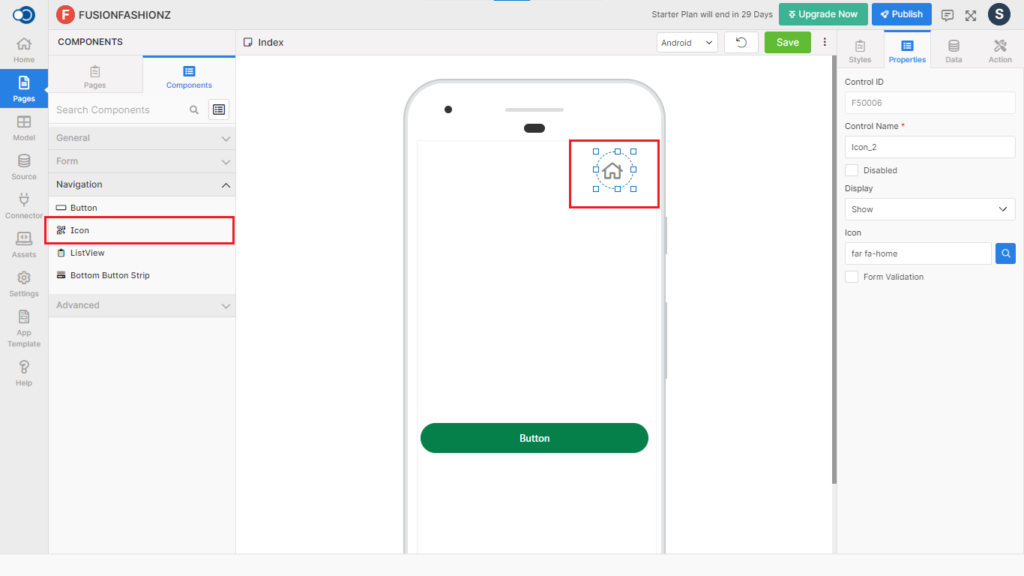
Icon allows an app user to place an image on a page to denote a specific purpose. This control has various properties that are explained in the below sections.
Properties
Parameter
Description
Control Name
By default, the control type is posted with a unique number e.g. Icon_1. Can be changed by the user using alphabets, numbers and special character (_). The maximum character limit is 100.
Disabled
Checkbox that disables the icon if checked.
Display
Toggle the display of the icon on choosing Hide/Show.
Icon
Choose the image to be displayed as an icon.
Form Validation
Checkbox that performs the validation if checked.
Style
General
Parameter
Description
Type
Displays the type of the icon as Normal
Icon Type
Choose the icon type from Solid, Regular and Light
Size
Choose the size of the icon from Small, Medium, Large, Extra Large and Custom sizes
Size Details
Displays the size details based on the selected size
Active Opacity
Define the active opacity of the icon from a minimum of 0.1 to a maximum of 1.
Background Size
Choose the background size from a minimum of 1 to a maximum of 100.
Color
Parameter
Description
Color
Choose the color of the icon
Background Color
Choose the background color of the icon
Border
Parameter
Description
Width
Define the width from a minimum value of 1 to a maximum value of 310.
Color
Choose the color of the icon
Style
Choose the style of the border from Solid, Dotted and Dashed
Radius
Choose the radius of the border from a minimum of 1 to a maximum of 100.
Events
Define the events that are to be triggered whenever there is a change.
Parameter
Description
onPress
OnPress event is fired when the user clicks the button control
onLongPress
OnLongPress event is fired when the user presses a button control or tap a button and holds it down for a second or two.
Actions
Define actions to be performed on the occurrence of the events.
Parameter
Description
Navigate To
Select the page to which the app user is to be navigated when the icon is clicked.
