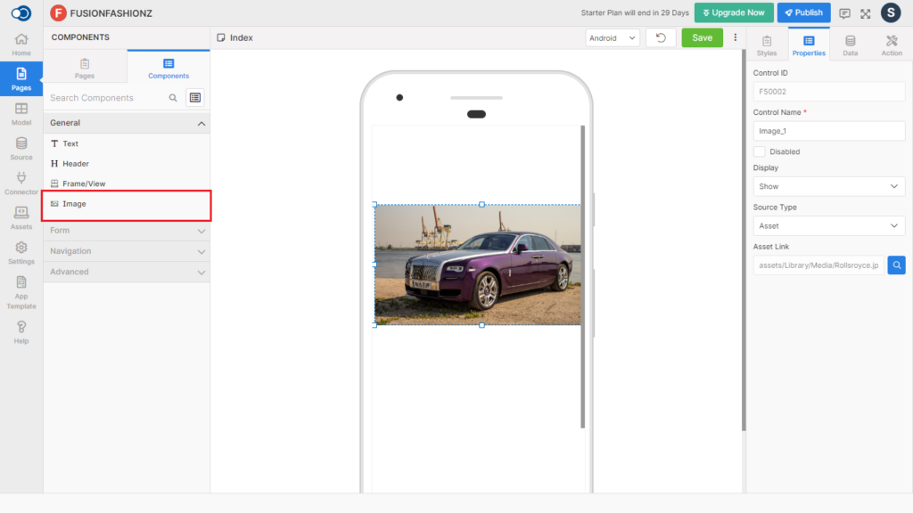
Image allows an app user to select and upload an image. This control has various properties that are explained in the below sections.
Properties
Parameter
Description
Control Name
By default, control type is posted with a unique number e.g. Image_4. Can be changed by the user using alphabets, numbers and special character (_). The maximum character limit is 100.
Disabled
Checkbox that disables the image if checked.
Display
Toggle the display of the image on choosing Hide / Show.
Source Type
Choose the source type of the image file from URL & Asset
Source
Provide the URL in the source if the source type is URL.
Asset Link
Choose the image asset link for including the image from the Assets available in the application
Style
General
Parameter
Description
Blur Radius
Define the radius upto which the image can be blurred from a minimum of 1 to a maximum of 100.
Resize Mode
Choose the resize mode from Cover, Contain, Stretch, Repeat, Center & Auto.
Active Opacity
Define the active opacity of the image from a minimum of 0.1 to a maximum of 1.
Layout
Parameter
Description
Width
Define the width from a minimum of 1 to a maximum of 310.
Height
Define the height from a minimum of 1 to a maximum of 570.
Opacity
Define the opacity of the image from a minimum of 0.1 to a maximum of 1.
Color
Parameter
Description
Background Color
Choose the desired color for the background from the color palette
Tint Color
Choose the desired tint color from the color palette
Border
Parameter
Description
Width
Define the width from a minimum of 1 to a maximum of 310.
Color
Choose the color of the border from the color palette
Style
Choose the style of the border from Solid, Dotted & Dashed patterns.
Border Radius
Choose the border radius from 0 to 100.
Spacing
Parameter
Description
Margin
Define the required space between the edges of the textbox and the screen to align the text with respect to the Left, Right, Top & Bottom margins.
Padding
Define the required space between the border and the content to align the text with respect to the Left, Right, Top & Bottom margins.
Events
Define the events that are to be triggered whenever there is a change.
Parameter
Description
onClick
Define an action that is to be performed when there is a click on the image
onLongClick
Define an action that is to be performed when there is a long click on the image
onError
onError event is fired when there is an error in video
Actions
Define actions to be performed on the occurrence of the events.
Parameter
Description
Navigate To
Select the page to which the app user is to be navigated when the image is clicked.