Text allows an app user to display the desired information. This control has various properties that are explained in the below sections.
Properties
Parameter
Description
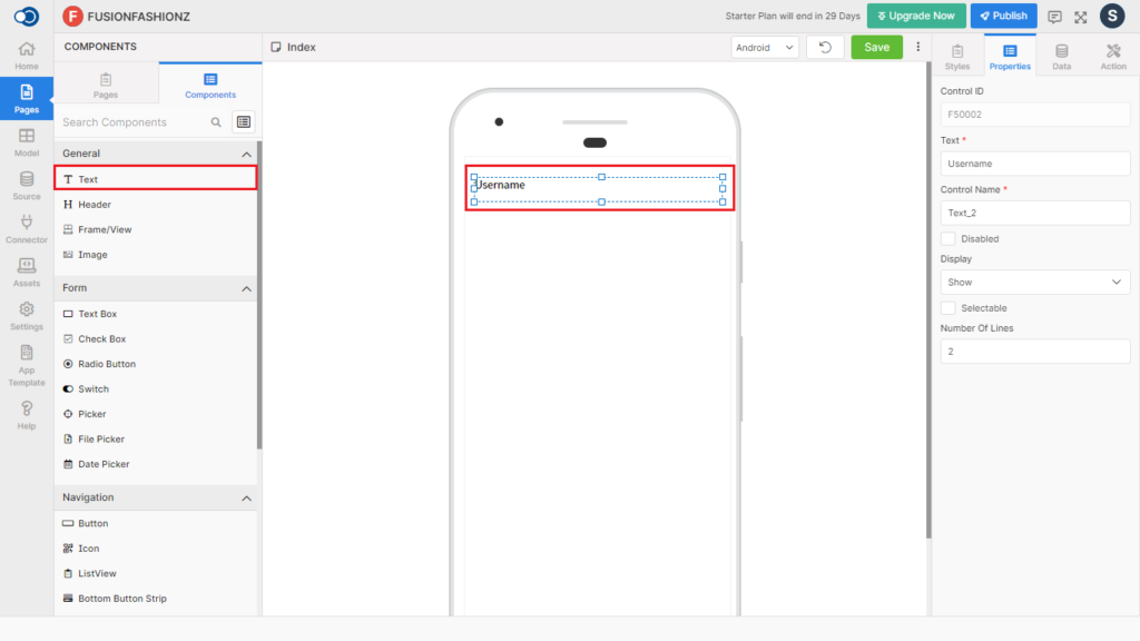
Text
Type in the text to be displayed on the page e.g. Create Your account
Control Name
By default, the control type is posted with a unique number. Can be changed by the user using alphabets, numbers, and special character (_). The maximum character limit is 50.
Disabled
Checkbox that disables the text if checked.
Display
Toggle the display of the text by choosing Hide/Show.
Selectable
Checkbox that allows the app user to select the field to be used in other pages if checked.
Number of Lines
A selectable field for choosing the total number of lines from 1 to 50 to display the text.
Style
General
Parameter
Description
Text Size
Choose the size of the text from H1, H2, H3, H4, H5 & H6.
Opacity
Define the opacity of the Text from a minimum of 0.1 to a maximum of 1.
Layout
Parameter
Description
Width
Define the width of the text from 1 to 310.
Height
Define the height of the text from 1 to 570.
Color
Parameter
Description
Color
Pick a color for the border of the text
Background Color
Pick a color for the background of the text
Alignment
Parameter
Description
Horizontal Alignment
Make the horizontal alignment of the text with the available styles – Auto, Left, Right, Center & Justify.
Vertical Alignment
Make the vertical alignment of the text with the available styles – Auto, Top, Bottom & Center
Font
Parameter
Description
Font Family
Choose the font for the text from System, SansPro, & Google SansPro.
Font Size
Increase or Decrease the font size from 7 to 36.
Font Weight
Modify the font-weight from Normal to Bold. By default, font-weight will be Normal.
Decoration
Highlight the text with the decoration like Underline, Inline-through & Underline inline-through.
Transform
Toggle the text case using Lowercase, Uppercase & Capitalize options or remove the style with None.
Border
Parameter
Description
Border Width
Define the width of the border for the text from the range of 1 to 5.
Border Color
Choose the color for the border from the color palette.
Border Style
Choose the style of the border from Solid, Dotted, & Dashed patterns.
Spacing
Parameter
Description
Margin
Define the required space between the edges of the text and the screen to align the text with respect to the Left, Right, Top, & Bottom margins.
Padding
Define the required space between the border and the content to align the text with respect to the Left, Right, Top, & Bottom margins.
Events
Define the events that are to be triggered whenever there is a change.
Parameter
Description
onPress
Define an action that is to be performed when the text is pressed.
onLongPress
Define an action that is to be performed when there is a long press on the text.
Actions
Define actions to be performed on the occurrence of the events.
Parameter
Description
Navigate To
Select the page to which the app user is to be navigated when the text is pressed.