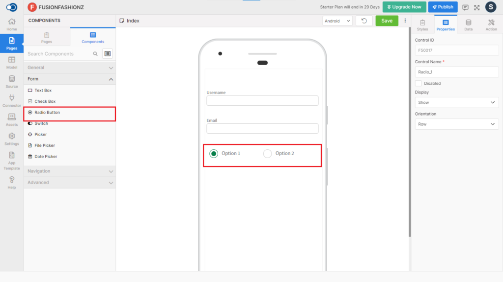
Radio button allows an app user to choose one among many. This control has various properties that are explained in the below sections.
Properties
Parameter
Description
Control Name
By default, the control type is posted with a unique number e.g. Radio_1. Can be changed by the user using alphabets, numbers and special character (_). The maximum character limit is 100.
Disabled
Checkbox that disables the radio button if checked.
Display
Toggle the display of the radio button on choosing Hide/Show.
Orientation
Choose the orientation of the radio button from Row & Column
Style
Layout
Parameter
Description
Width
Define the width of the radio button from 1 to 310.
Height
Define the height of the radio button from 1 to 310.
Color
Parameter
Description
Text Color
Choose the desired color for the radio button from the color palette
Checked Color
Choose the color to be used for the radio button if it is checked
Unchecked Color
Choose the color to be used for the radio button when it is unchecked
Font
Parameter
Description
Font Size
Define the font size from 7 to 36
Font Family
Choose the font for the radio button from System, SansPro & Google SansPro.
Font weight
Modify the font-weight between Normal & Bold.
Events
Define the events that are to be triggered whenever there is a change.
Parameter
Description
onChange
Define an action that is to be performed when there is a change in the value of the radio button
Actions
Define actions to be performed on the occurrence of the events.
Parameter
Description
Navigate To
Select the page to which the app user is to be navigated when the radio button is pressed.