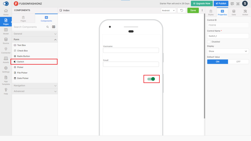
Switch allows an app user to perform an event whenever the value changes between ON and OFF. This control has various properties that are explained in the below sections.
Properties
Parameter
Description
Control Name
By default, the control type is posted with a unique number e.g. Switch_1. Can be changed by the user using alphabets, numbers and special character (_). The maximum character limit is 100.
Disabled
Checkbox that disables the switch if checked.
Display
Toggle the display of the switch by choosing Hide/Show.
Default Value
Indicate the default value of the switch is to be ON or OFF
Style
Track / Thumb Color
Parameter
Description
ON
Choose the color of the switch when it is ON
OFF
Choose the color of the switch when it is OFF
Spacing
Parameter
Description
Margin
Define the space required between the edges of the switch and the screen to align the switch with respect to the Left, Right, Top & Bottom margins.
Padding
Define the space required between the border and the switch to align the switch with respect to the Left, Right, Top & Bottom margins.
Events
Map the events that should happen with the value change in the switch.
Parameter
Description
onChange
Define the action that is to be performed when the value of the switch changes.