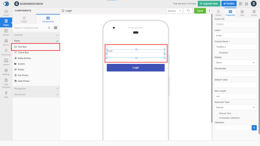
Textbox allows an app user to type the required information including words, passwords, or numbers. This control has various properties that are explained in the below sections.
Properties
Parameter
Description
Label
Name of the textbox to be displayed on the page.
Control Name
By default, the control type is posted with a unique number. Can be changed by the user using alphabets, numbers and special character (_). The maximum character limit is 100.
Disabled
Checkbox that disables the textbox if checked.
Display
Toggle the display of the textbox by choosing Hide/Show.
Placeholder
Short note describing the expected value of the textbox, to be displayed in the label before an app user enters a value.
Default Value
Default value to be displayed
Max Length
Maximum allowable length for the textbox – 500 characters
Keyboard Type
Choose the type of keyboard you can use from among Default, Numeric, Number-pad & Email-address
Secure Text
Checkbox that secures the textbox if checked
Immediate Validation
Checkbox that does the immediate validation of the textbox if checked
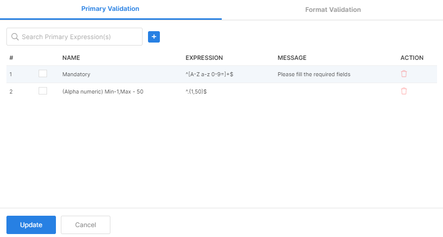
Validation
Style
Choose the styles, layout design, font types, etc., for the text box.
General
Parameter
Description
Type
Choose the type of text from Normal Text, Line Text & Text Area
Layout
Parameter
Description
Width
Define the width of the textbox from 1 to 310.
Height
Define the height of the textbox from 1 to 570.
Color
Parameter
Description
Title Color
Pick a color for the title of the textbox
Text
Choose the color of the text
Background Color
Choose the background color
Placeholder Color
Choose the placeholder color
Alignment
Parameter
Description
Title Align
Align the title with the available styles – Auto, Left, Right, Center & Justify.
Text Align
Align the text with the available styles – Auto, Left, Right, Center & Justify.
Font
Title
Parameter
Description
Family
Choose the font of the text from System, SansPro & Google SansPro.
Size
Increase or Decrease the font size from 1 to 36.
Weight
Modify the font-weight between Normal & Bold.
Text
Parameter
Description
Family
Choose the font of the text from System, SansPro & Google SansPro.
Font Size
Increase or Decrease the font size from 1 to 36.
Font Weight
Modify the font weight between Normal & Bold.
Border
Parameter
Description
Border Width
Define the width of the border for the textbox from the range of 1 to 5.
Bottom Width
Define the bottom width
Radius
Choose the border radius from 1 to 100
Color
Choose the desired color for the border from the color palette.
Style
Choose the style of the border from Solid, Dotted & Dashed patterns.
Spacing
Parameter
Description
Margin
Define the required space between the edges of the textbox and the screen to align the text with respect to the Left, Right, Top & Bottom margins.
Padding
Define the required space between the border and the content to align the text with respect to the Left, Right, Top & Bottom margins.
Events
Define the events that are to be triggered whenever there is a change.
Parameter
Description
onChange
Define an action that is to be performed when there is a change in the text.
onBlur
Define an action that is to be performed when the textbox becomes blurred.
onFocus
Define an action that is to be performed when the textbox is focused.