Overview
Pages are the basic elements that are useful in designing and creating an app in the OREOPS application. These pages allow app users to capture, process and store relevant information. You can create a page, edit the properties and styles of the created page.
While creating a design, the user need to click on Page Option

Then click on Edit option to edit the design
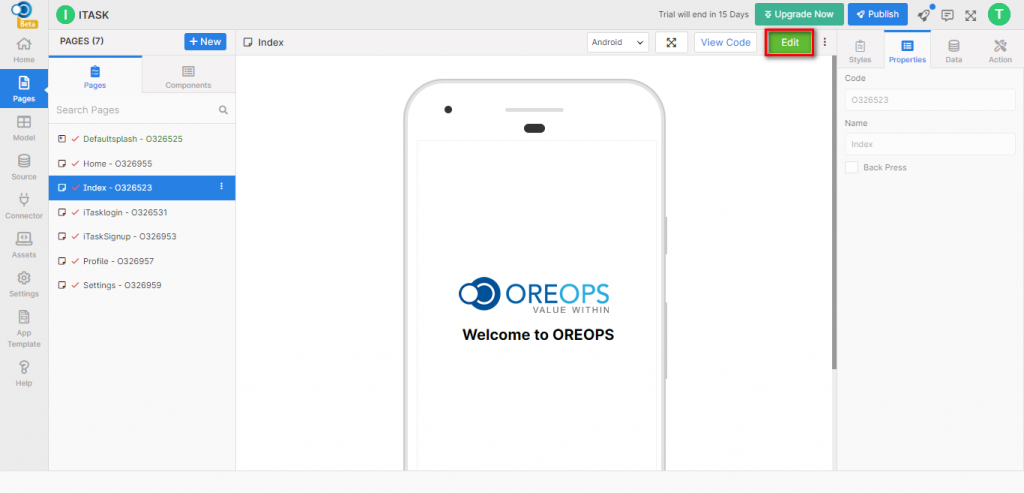
On creating an app, an Index page is added to the app by default. You can either use it as such or modify the page or create a new page and use it in the app creation.
Page Categories
Pages are of various categories namely – Default, Drawer, Splash, Introslider & Bottom Tab Navigator.
- Index – A page that is loaded into the app by default, once the app is created.
- Drawer – A page designed with a drawer icon allowing an app user to select the page by choosing the drawer icon or by swiping on the left side of the page. Four styles are available on a drawer page namely
- Drawer With Icon – Center Aligned
- Drawer Without Icon – Center Aligned
- Drawer With Icon – Left Aligned
- Drawer Without Icon – Left Aligned
- Splash – A splash page allows you to create a splash screen for providing an introduction to an App; This page shows up when the app is loading, and once the app is downloaded and opened up in the mobile. Five styles of splash screens are available.
- Intro Slider – An intro slider page allows you to provide a brief introduction regarding the app if an end-user of the app swipes the screen through a slider. Two styles of intro slider pages are in-built in the OREOPS application.
- Bottom Tab Navigator – A bottom tab navigator page defines a footer tab with icons that switches between pages when an end-user of the app swipes the screen. Two styles of bottom tab navigator pages are available namely Footer with Text & Footer without Text.
Page Operations
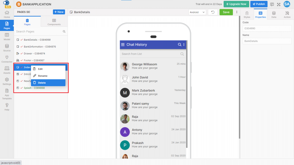
Following are the different operations that can be performed in the pages:
View – View the design, styles and properties of the page
Rename – Modify the name of the page created
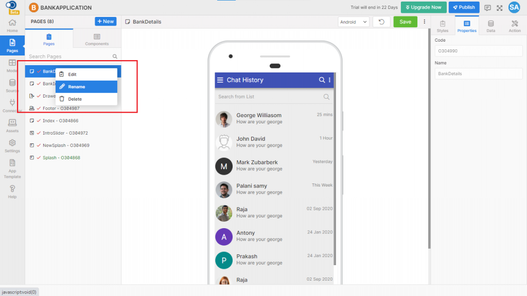
Delete – Delete the page if you are not going to use the page in any of the apps created.
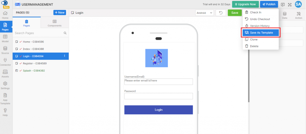
Save As Template – Save the page that you are going to use repeatedly as a template, use it in designing other apps. You can select any of the templates when creating a new page for the app design.
Clone – Create a clone (copy) of the page you are designing for use in future applications.
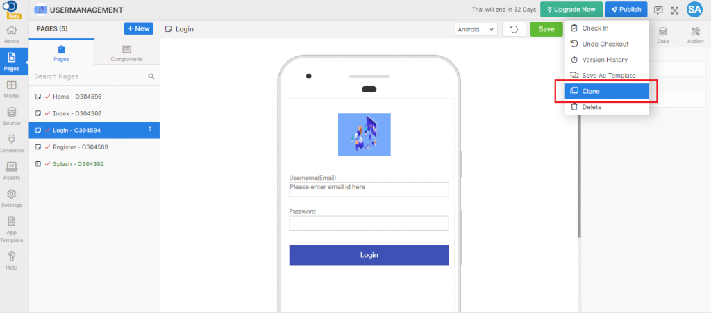
When giving clone, only the design styles and properties of the page are cloned. Events and actions defined on the page are to be defined again on the cloned page.
Check-in – Use a page from one app along with the styles and properties in another app by using check-in.
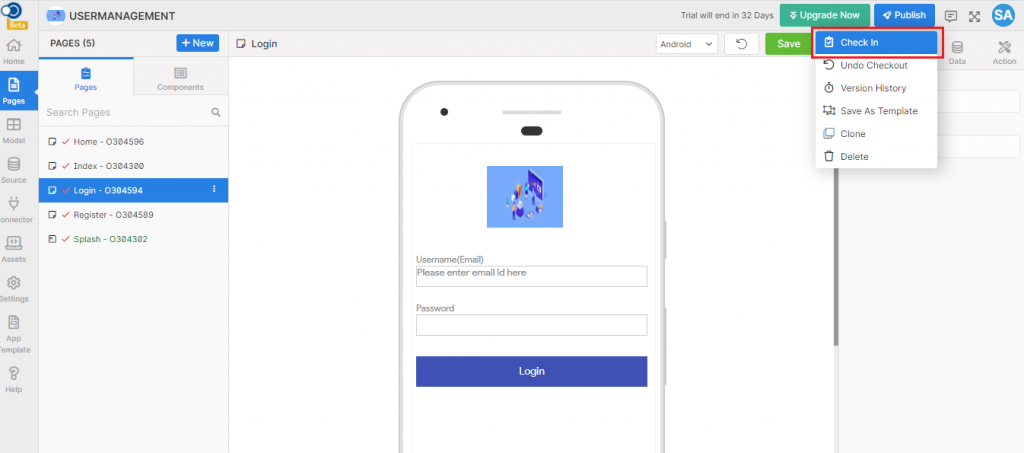
Choose the purpose of check-in and provide the remarks to check-in the page. On giving Check-in, the changes saved by the app user until check-in are included in the page. The checked-in page is indicated with a lock symbol.
Check-out – Check-out the page if you do not want to make any further changes to the page.
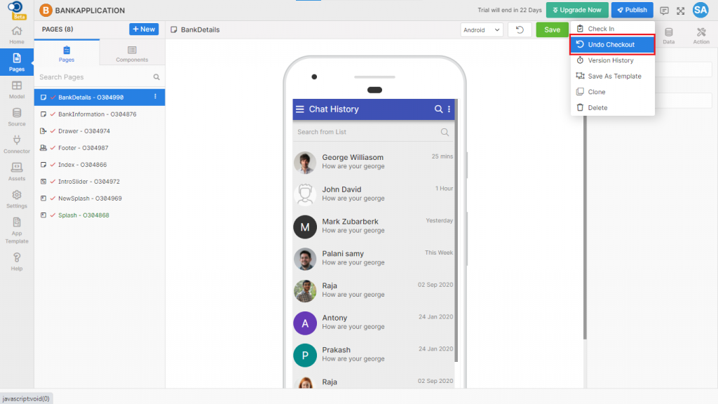
Undo Check-out – If you have done an incorrect check-out, you can undo the operation. On giving Undo Check-out, the last version of the page will be checked out.
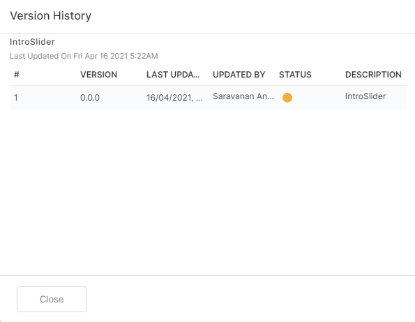
Version History – View your page check-in and check-out details in the Version History. All versions of the page are displayed in descending order. The checked-out page status will be indicated in green color and the status of the page you are working on will be displayed in amber color.