
Intro Slider page allows you to provide a brief introduction regarding the app if the end-user of the app swipes the screen through a slider. Two styles of intro slider pages are in-built in the OREOPS application.
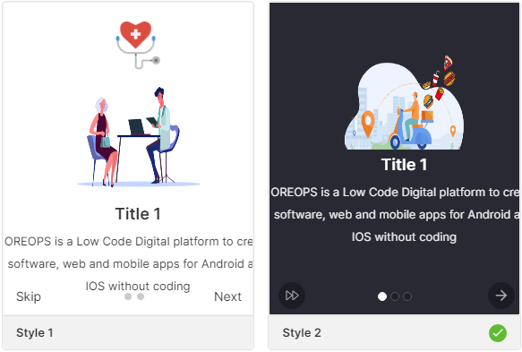
You can choose anyone of the styles while creating an app and modify the styles, properties, logo, and description according to the app design.
Properties
Modify the properties by opening the page and clicking on the Edit button on the right side of the page.
| Parameter | Description |
|---|---|
| Control Name | Displays the name of the page |
| Auto Swipe | Checkbox that allows auto swiping on the page. By default, it is checked |
| Auto Swipe Repeat | Checkbox that allows auto swiping to be repeated on the page |
| Auto Page Navigate | Checkbox that allows automatic page navigation on the page. By default, it is checked |
| Auto Navigate Duration | Define the duration of automatic page navigation on the page from 2000, 3000, 4000 & 5000 seconds |
| Bottom Button Type Icon | Checkbox that allows display of bottom button icon on the page. By default, it is checked |
| Bottom Button Type Icon Style | Choose the Bottom Button Type Icon Style from Regular, Solid & Light |
| Skip Button | Checkbox that allows display of skip button on the page |
| Skip Icon Name | Choose the name of the skip icon to be displayed |
| Skip Icon Color | Choose the color of the skip icon to be displayed |
| Skip Icon Background Color | Choose the color of the skip icon background to be displayed |
| Next Button | Checkbox that allows display of next button on the page. By default, it is checked |
| Next Icon Name | Choose the name of the next icon to be displayed |
| Next Icon Color | Choose the color of the next icon to be displayed |
| Next Icon Background Color | Choose the color of the next icon background to be displayed |
| Back Button | Checkbox that allows display of back button on the page |
| Back Icon Name | Choose the name of the back icon to be displayed |
| Back Icon Color | Choose the color of the back icon to be displayed |
| Back Icon Background Color | Choose the color of the back icon background to be displayed |
| Done Button | Checkbox that allows display of done button on the page. By default, it is checked |
| Back Icon Name | Choose the name of the done icon to be displayed |
| Back Icon Color | Choose the color of the done icon to be displayed |
| Done Icon Background Color | Choose the color of the done icon background to be displayed |
Style
Choose your favorite styles for the pages with the following options.
Layout
Logo
| Parameter | Description |
|---|---|
| Width | Choose the width of the Logo from 1 to 310 |
| Height | Choose the height of the Logo from 1 to 310 |
Image
| Parameter | Description |
|---|---|
| Width | Define the width of the image |
| Height | Define the height of the image |
Color
| Parameter | Description |
|---|---|
| Title | Choose the color for the title |
| Description | Choose the color for the description |
| Active Dot | Choose the color for the active dot |
| Inactive Dot | Choose the color for the inactive dot |
Font
Title
| Parameter | Description |
|---|---|
| Font Family | Choose the font for the title such as System, SansPro, & Google SansPro |
| Font Size | Increase or Decrease the font size of the title from 1 to 30. By default, the font size will be 20 |
| Font Weight | Modify the font-weight of the title from Normal to Bold. By default, font weight will be Normal. |
| Transform | Toggle the case of the title using Lowercase, Uppercase & Capitalize options or remove the style using None |
Description
| Parameter | Description |
|---|---|
| Font Family | Choose the font for the description such as System, SansPro, & Google SansPro |
| Font Size | Increase or Decrease the font size of the description from 1 to 30. By default, the font size is 20 |
| Font Weight | Modify the font-weight of the description from Normal to Bold. By default, the font-weight is Normal. |
| Transform | Toggle the case of the description using Lowercase, Uppercase & Capitalize options or remove the style using None |
Data
Data Source
Data sources available on the page are of two types namely Direct and Model.
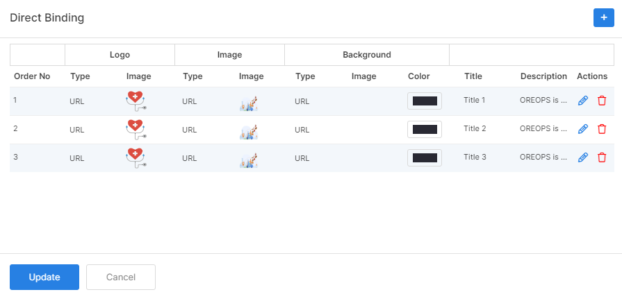
Direct
Configure the datasource as direct hardcode and add the number of menus to be listed in the drawer. On choosing the data source as Direct, data binding and datasource of the model are disabled.
Data Mapping – Configure the data source to be mapped to each element of the components selected in the page. You can add the number of menus that are to be listed in the drawer.
On clicking the icon against the Data Mapping, the fields to be bound are displayed as shown below:
| Parameter | Description |
|---|---|
| Order Number | Order of the image to be displayed on the page |
| Type | Type of source of the logo image; whether image source is a URL or an asset |
| Image | Image to be added as a logo on the page |
| Type | Type of source of the image; whether image source is a URL or an asset |
| Image | Image to be added in the middle of the page |
| Type | Type of the background image source; whether the image source is a URL or an asset |
| Image | Background image to be added on the page |
| Color | Choose the color of the background |
| Title | Provide the title of the page |
| Description | Description to be displayed on the page |
Model
Configure the data source as Model to access the data from the model configuration. In this case, the Direct data mapping configuration is disabled.
Data Binding
| Parameter | Description |
|---|---|
| Data Model | Choose the data model to be used on the page |
| Data Field | Select the data field to be displayed on the page |
Data Source
Select the data source for this type and provide the details accordingly.
| Parameter | Description |
|---|---|
| Data Model | Choose the data model to be used on the page |
| Logo Field | Choose the logo to be displayed |
| Image Field | Choose the image to be displayed |
| Title Field | Provide the title to be displayed |
| Content Field | Provide the content to be displayed |
Events
Define events to be performed whenever an action happens in the app.
| Parameter | Description |
|---|---|
| onLoad | onPageLoad event is fired when the page is loading |
| onSkip | OnSkipClick event is fired when the user clicks the skip option |
| onDone | OnDoneClick event is fired when the user clicks the done option |
Actions
Define actions to be performed on the occurrence of the events.
| Parameter | Description |
|---|---|
| Navigate To | Navigates the app user to a desired page on occurrence of the event. Choose the desired page from among the list of available pages. For e.g. If an onPress event occurs, then the app user is redirected to the selected page. |